

These are the winners of the inaugural 2016 Data Stories videos, highlighting the most creative scientific stories.
Sponsored by the Advancement of Science (AAAS), entries ranged from climate change, oceanography, astronomy and more.
Above: screen shot from the Martian Atmosphere Loss Explained
A selection of the incredible videos:
Corporate Winner: Martian Atmosphere Loss Explained
by Daniel Gallagher from NASA’s Scientific Visualization Studio.
Professional Winner: Are Gazelles Endangered?
by R.J. Andrews from Info We Trust.
Glass Brain Flythrough
by Roger Anguera from San Francisco’s University of California.
Student Winner: How People Gather
by Ulf Aslak Jensen, a masters student at the Technical University of Denmark (DTU).
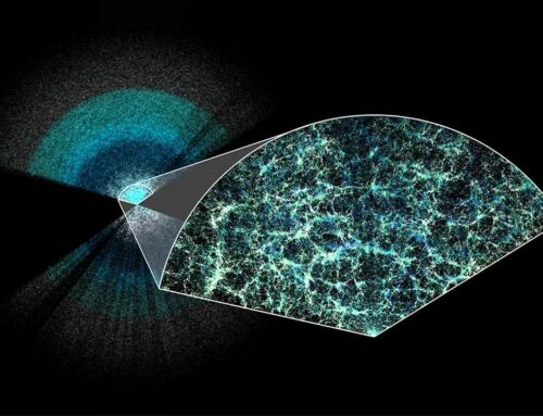
The Network Behind the Cosmic Web
by Kim Albrecht from the Center for Complex Network Research.
The Sun as a Pie Chart
by Tom Bridgman from NASA Goddard Multimedia.
The Causes of Gun Violence Identified
by Gabriel Reilich from GOOD.
Garbage Patch Visualization Experiment
by NASA’s Data Visualization Studios.
The Incredible Journey of a Single Tropical Storm
by Alex Kekesi of GST.
Data-Driven Dust Visualization
by NASA’s Kel Elkins
More visualizations here.


Leave A Comment