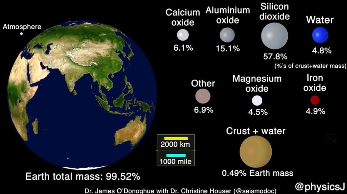
The Scale and Composition of the Earth’s Crust
The scale and composition of the Earth's crust, the layer upon which every living thing has ever lived.
Honored Inverted In-Flight Image
NASA photographer Jim Ross was honored for a thrilling inverted in-flight aerobatic maneuvers image.
Arsenale ‘Plan B’ Hybrid Adventure electric bike
Arsenale introduced 'Plan B', a lightweight, long-range, 2-wheel-drive hybrid electric bike.
New Hydrogen Fuel Cells
New eco-friendly Hydrogen fuel cells pack more power, making long-distance hydrogen electric flights possible.
Riva El-Iseo Fully-Electric Motor Yacht
Riva's El-Iseo marks the famed boat builder's debut in fully electric motor yachts.
Farewell to HD Atlas Robot
For nearly ten years, Atlas robot has fired up our creativity, motivated budding designers, and hurdled over technical obstacles.
Neil deGrasse Tyson Explains The Three-Body Problem
What is the three-body problem? Neil deGrasse Tyson and comedian Chuck Nice explain why the three-body problem is unsolvable and what makes it mathematically chaotic.
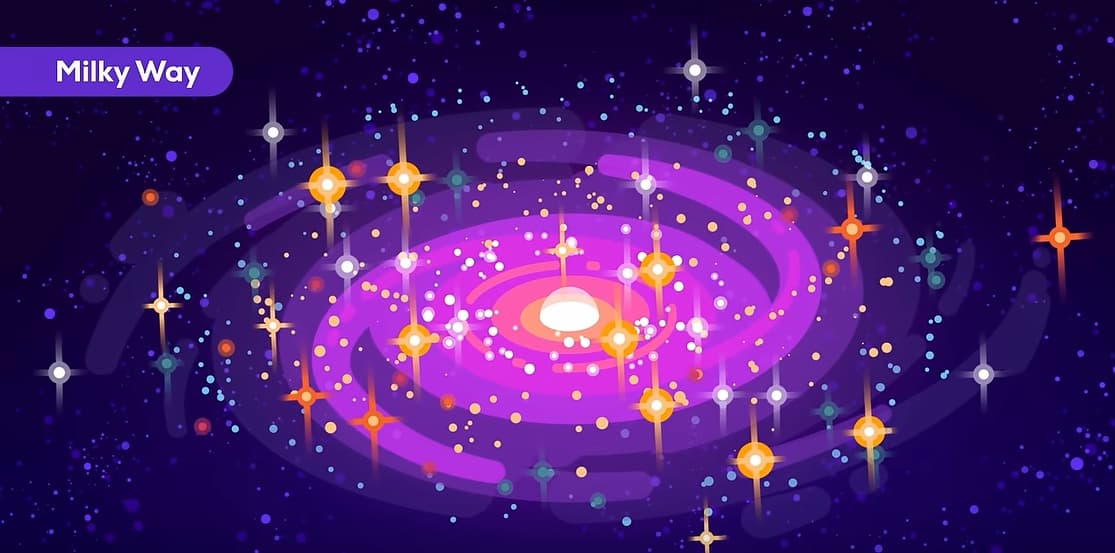
Are There Thousands of Alien Empires in The Milky Way?
Are there thousands of Alien Empires in the Milky Way? What if space exploration is always difficult, no matter how advanced you are?
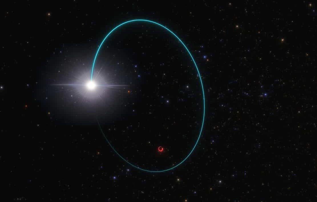
Huge Stellar Black Hole in the Milky Way discovered
A huge stellar black hole just 2,000 light-years away in the constellation Aquila, 33 times as massive as the Sun, was discovered.
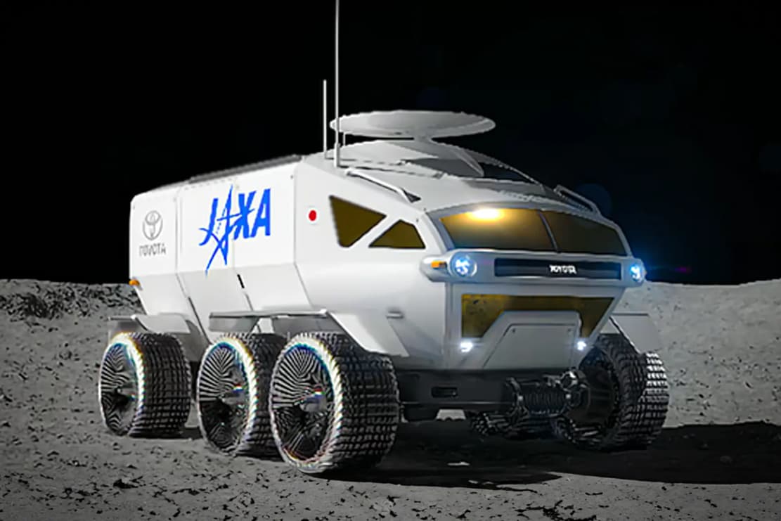
Japan to build NASA a Lunar Rover
Japan will design, develop, and operate a pressurized Lunar rover for NASA, for crewed and uncrewed exploration on the Moon.


