Beta Alia’s eVTOL manned hovering transition to cruise flight
Beta Alia eVTOL achieves a historic first with a manned hovering transition, to cruise flight.
Smart Concept #5 SUV
The Smart Concept #5 is a spacious and versatile vehicle, marking the all-electric brand’s entry into the premium mid-size SUV segment.
Pininfarina Formula Simulator Concept
Designer Fabio Bilotta with the Pininfarina Formula Simulator concept is revolutionizing Sim-Racing.
What’s Really Happening At CERN
The world’s most astonishing science experiment at CERN explained.
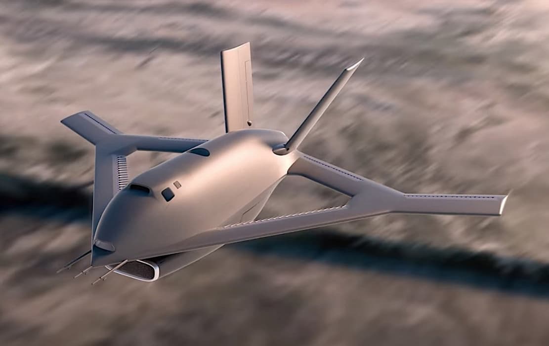
Aurora X-65 Prototype Aircraft
Aurora X-65 prototype aircraft has no moving parts on the exterior and uses holes in its wings to reach Mach speeds.
The Las Vegas–LA electric high-speed rail line just launched
The Brightline Las Vegas–L.A. electric high-speed rail line just launched.
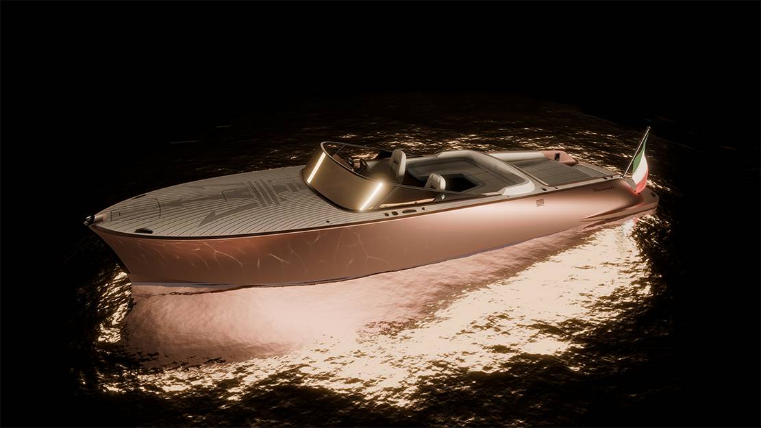
Maserati Tridente All-Electric Powerboat
Maserati Tridente all-electric powerboat is a 10.5-meter beauty perfect for leisurely cruises with up to eight guests.
MG EXE181 Single-Seater Hypercar concept
The MG EXE181 single-seater hypercar concept was just unveiled for the Beijing Auto Show and came with a smooth and stretched-out design ending in a longtail.
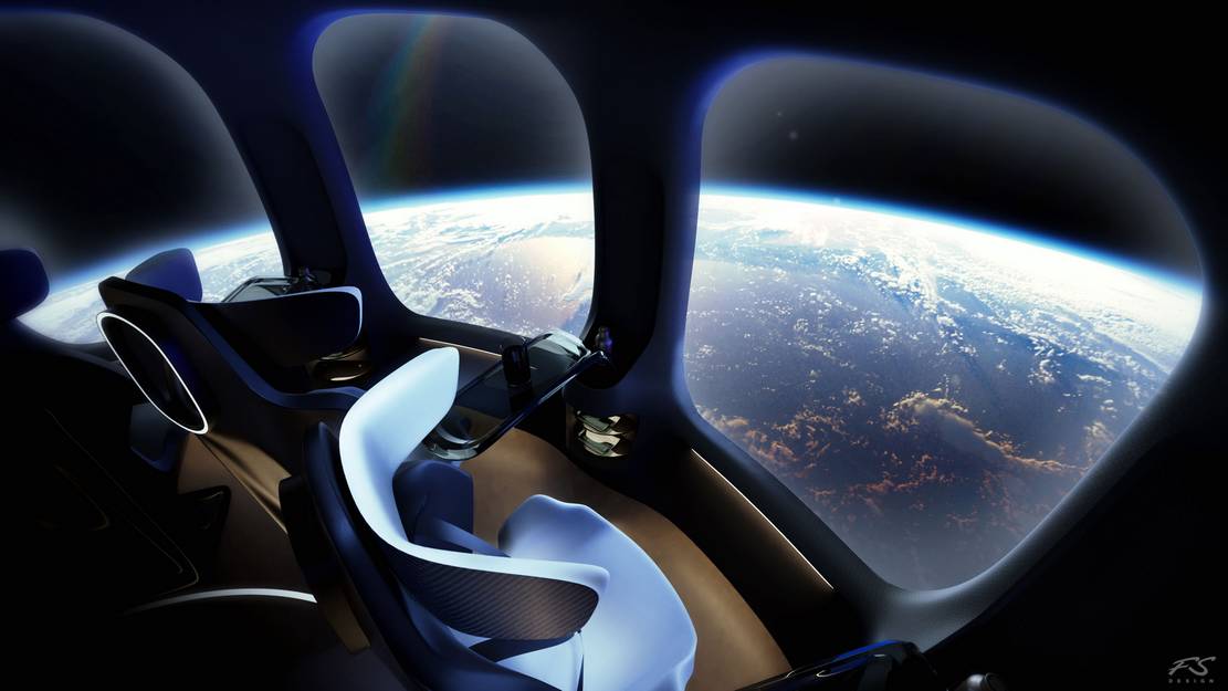
New Luxury Halo Space Capsule
The new luxury Halo Space Capsule offers a unique experience that takes you to the stratosphere.
The crazy Screw Bike
This is a screw bike with two omni-wheels that can move it in any direction.


