Officially announced that 2015 was the warmest year ever recorded on Earth, and it was not even close!
Scientists from NASA and the National Oceanic and Atmospheric Administration (NOAA), on January 20, 2016, released their analyses of surface temperatures for the past year:
The NASA team found that globally averaged temperatures from January through December 2015 were 0.87 degrees Celsius (1.57° Fahrenheit) above the norm (defined as a 1951–1980 base period). The previous record—set last year—was 0.74°C (1.34°F) above the norm. For the planet, 2015 was more than a full degree Celsius (1.8°F) warmer than temperatures in 1880, when consistent record-keeping began.
NOAA researchers, working independently, found 2015 to be 0.90°C (1.62°F) above the 1901–2000 average. According to their analysis, 2015 was the second warmest year on record for the continental United States, Africa, and Europe. It was the warmest year for Asia and South America. Globally, new monthly temperature records were set in every month except January and April.
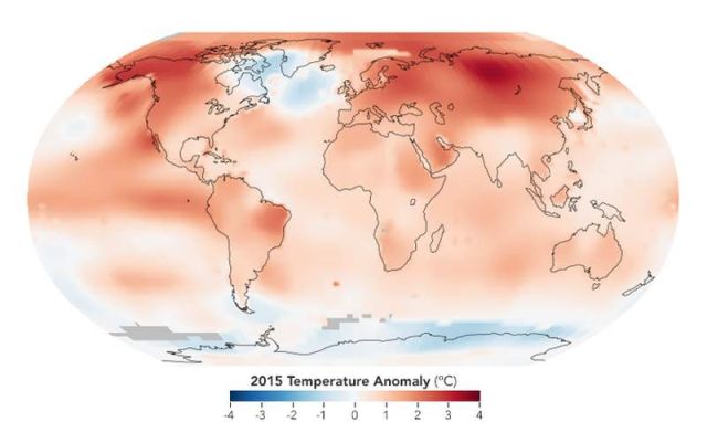
The map above depicts global temperature anomalies in 2015. It does not show absolute temperatures, but instead shows how much warmer or cooler the Earth was compared to a baseline average from 1951 to 1980. The team from NASA’s Goddard Institute for Space Studies (GISS) assembles its temperature analysis from publicly available data acquired by roughly 6,300 meteorological stations around the world; by ship- and buoy-based instruments measuring sea surface temperature; and by Antarctic research stations. This raw data is analyzed using methods that account for the varied spacing of temperature stations around the globe and for urban heating effects that could skew the calculations.
For more explanation of how the analysis works, read World of Change: Global Temperatures.
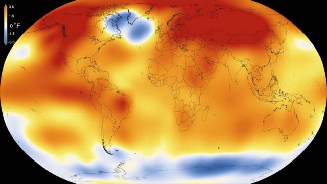
This visualization illustrates Earth’s long-term warming trend, showing temperature changes from 1880 to 2015 as a rolling five-year average. Orange colors represent temperatures that are warmer than the 1951-80 baseline average, and blues represent temperatures cooler than the baseline.
Credit: NASA Goddard Space Flight Center’s Scientific Visualization Studio
Read more at nasa.gov/press-release


Leave A Comment