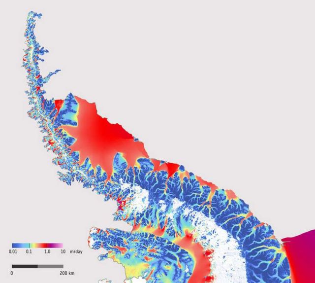
Successive radar images captured by the Copernicus Sentinel-1A satellite during December 2014 – March 2016, created this spectacular map, showing how fast the ice flows on the Antarctic Peninsula.
The map was constructed by tracking the movement of ice features in pairs of radar images taken 12 days apart.
Image credit ESA
This example shows the spectacular potential of the Sentinel-1 mission for routine mapping and monitoring the surface velocity of glaciers and ice sheets. The combination of Sentinel-1A and -1B will support comprehensive and long-term monitoring of changes in ice sheet velocity and how they respond to climate change.
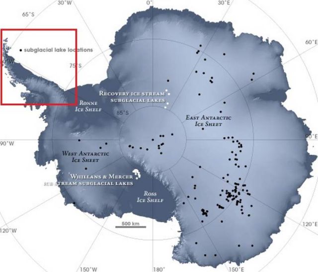
The Antarctic Peninsula is a narrow mountainous finger or spine of land extending northwards away from the Central Antarctic ice sheet (lower right corner) and comprises the northernmost arm of the Antarctic ice sheet.
The color scale indicates the speed of ice movement in meters per day, ranging from 1 centime per day or less in dark blue to up to 1 mete per day in red. The vivid colors trace a complex network of channels along which streams of ice flow from the high mountains down towards the coast where the ice flow speeds up and spreads out into floating ice shelves.
The white area on the western flank of the peninsula is where snowfall is likely to have concealed features and so prevented tracking between the image pairs.
As one of the most dynamic glacial environments on Earth, this region has been experiencing rapid climate warming over recent decades. Since 1991, satellites such as ESA’s ERS and Envisat have observed the disintegration of various ice shelves, including the northern portion of the Larsen ice shelf and the Wilkins ice shelf.
source ESA


Leave A Comment