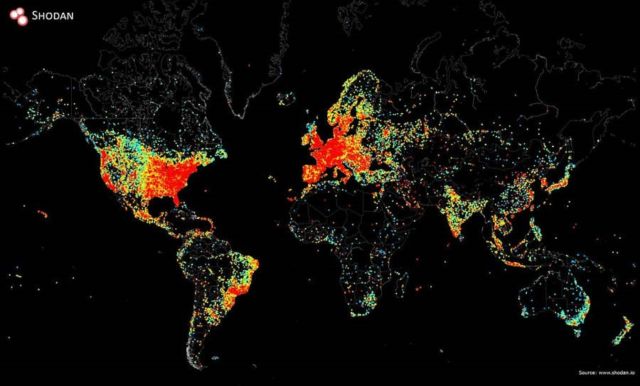
Impressive map shows every web-connected device on Earth
In the map red shows the most devices, yellow indicates moderate numbers and black areas are where no signal received.
Above, generated by sending an ICMP Echo request, collecting the responses and mapping the active IPs using Python. Credit John Matherly.
John Matherly, a cartographer and computer scientist, used software to ‘ping’ internet-connected devices and listening for their response.
In total, it took him about 12 hours to create the map.
The highest density of web-connections is in Europe and on the East coast of the United States.
via dailymail


Leave A Comment