How the World Map looks wildly different than you think. Take a look at this video…
Our world maps are not correct.
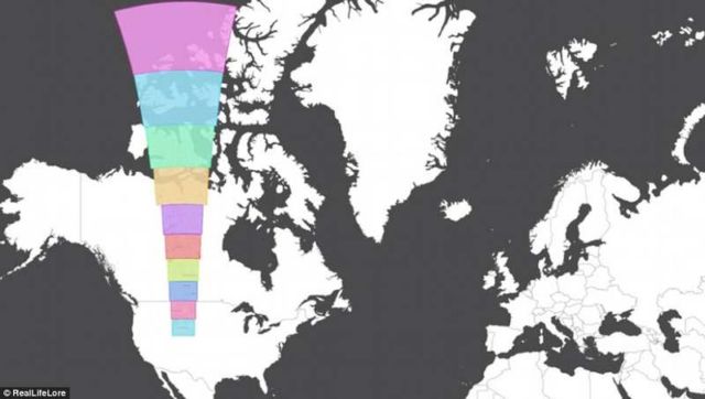
‘Mercator Projection,’ the representation of the spherical globe, the map we are mostly use, gives the right shapes of land masses, but distorts sizes near the poles.
The True Size, lets you drag-and-drop different countries around a world map, to see how they shrink or grow.
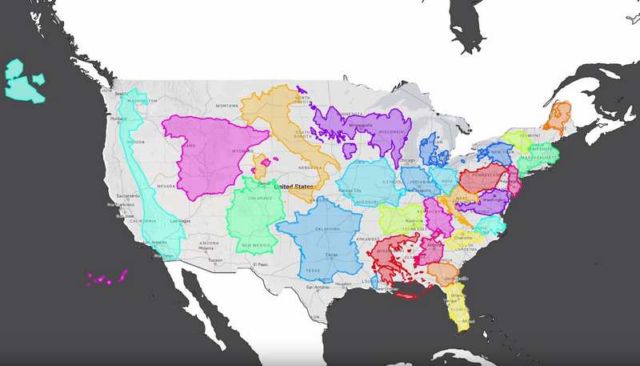
“All of us have seen a world map at some point in our lives before, but it is very difficult to imagine how certain countries and parts of the world compare to each other in size that are far apart.
In this video, I explore why the world looks very different than how it is portrayed in the Mercator Projection map. I then go on to explore how certain countries are unexpectedly larger or smaller than what they appear to be, and how some places looks wildly different than our perceptions.
PS; Don’t totally hate on the Mercator Projection, it’s actually a really useful map for navigation and on keeping the correct shape of countries while sacrificing the size that we can all laugh about!”


Leave A Comment