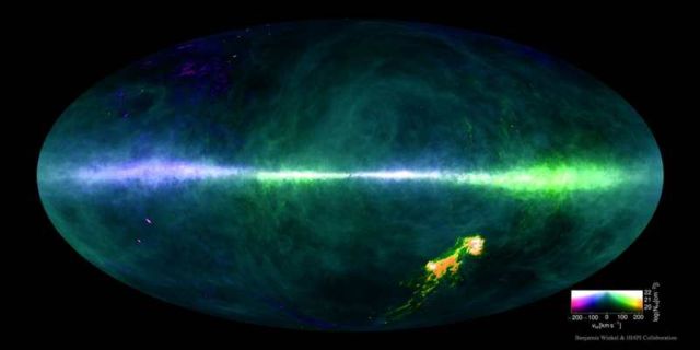
Spectacular detailed map of the Hydrogen in our Galaxy, the Milky Way.
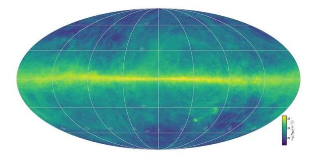
A new highest-resolution map of the sky in the universe’s most abundant gas — hydrogen — has been completed and recently released, along with its underlying data.
Featured above, the all-sky map of hydrogen’s 21-cm emission shows abundance with brightness and speed with color. Low radial speeds toward us artificially colored blue and low radial speeds away colored green. The band across the middle is the plane of our Milky Way Galaxy, while the bright spots on the lower right are the neighboring Magellanic Clouds.
This HI4PI map reflecting the total hydrogen content, was produced using data from the 100 metre Max-Planck radio telescope in Effelsberg, Germany and the 64 metre CSIRO radio telescope in Parkes, Australia.
University of Bonn astronomer Dr Juergen Kerp said:
“Radio ‘noise’ caused by mobile phones and broadcast stations pollute the faint emissions coming from stars and galaxies in the Universe.
So sophisticated computer algorithms have to be developed to clean each individual data point of this unwanted human interference.
Next to the thousands of observing hours an even larger amount of time has been spent creating the final scientific data product released today.”
via APOD


Leave A Comment