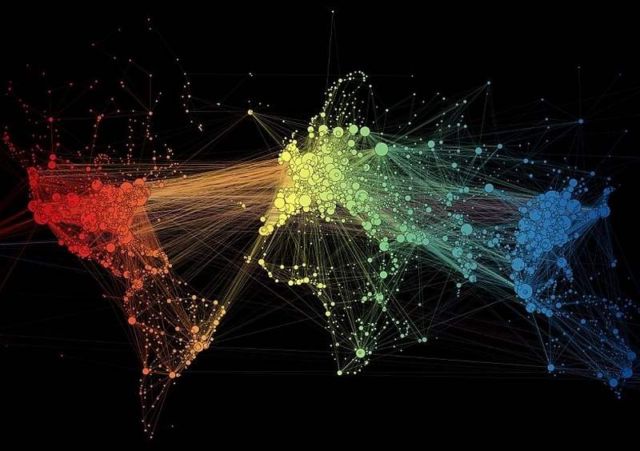
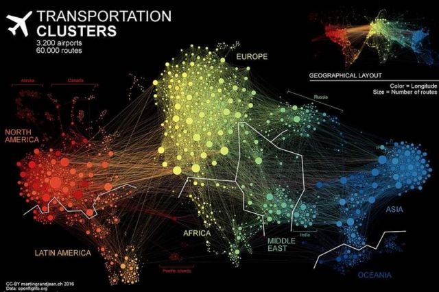
The most popular air travel hubs around the globe revealed in one impressive map.
In this visualization of 3,200 airports created by Martin Grandjean, longitude is represented by different colors, and the number of routes are indicated by size.
In the animation, the global map shows the 60,000 routes between the different countries, as they exist ‘without geographical constraints.’
Grandjean explains in his website:
This “map” is the result of the application of a force-directed layout algorithm on a graph of 3.275 airports (37.153 single routes – the weighted total is higher because many airlines take the same route), based on OpenFlights.org data. Naturally, network geography is not completely disrupted: the continents are mostly visible and regions are generally in their original position (with the exception of the Pacific islands that connect Asia and America – imagine this graph in three dimensions, with the Pacific Ocean behind).
via dailymail
source martingrandjean


Leave A Comment