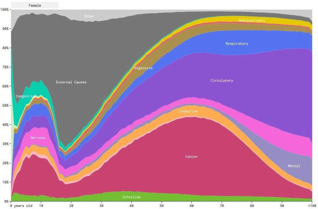
This chart visualizes how cause of death varies across sex and race, based on mortality data from 2005 through 2014.
In the interactive visualization select a group to see the changes and causes to see them individually.
The estimates for the number of people who die due to the causes, provided by CDC’s Underlying Cause of Death database.
There are many ways to die. Cancer. Infection. Mental. External. The Centers for Disease Control and Prevention classifies the ways into 113 causes, which are grouped into 20 categories of disease and external causes.
As you’d expect, some causes of death are more common than others. For example, about a third of people die from diseases of the respiratory system (like the flu), but less than three percent die from infectious or parasitic diseases (like Tuberculosis).
Then take age into account. It’s much more likely for older people to get cancer than it is for younger people.
Finally, look at cause across different groups of people and you see different distributions.
via gizmodo
source Flowing Data


Leave A Comment