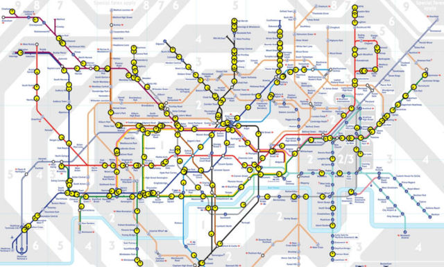
This amazing map shows all trains (yellow dots) on the London Underground network in approximately real time.
Schematic, Geographic version, or Skyfall version.
How does it work?
Live departure data is fetched from the TfL API, and then it does a bit of maths and magic. Some H&C and Circle stations are missing in the TfL feed.
[Matthew]


Leave A Comment