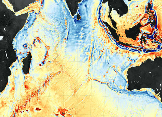
The map above shows seafloor gravity anomalies in the western Indian Ocean, a part of new global map based on Earth’s gravity field.
This detailed map assembled by David Sandwell of the Scripps Institution of Oceanography, Walter Smith of the National Oceanic and Atmospheric Administration, and colleagues. Shades of orange and red represent areas where seafloor gravity is stronger (in milligals) than the global average, a phenomenon that mostly coincides with the location of underwater ridges, seamounts, and the edges of Earth’s tectonic plates. The darkest shades of blue represent areas with the lowest gravity, corresponding to the deepest troughs and trenches in the ocean.
An international scientific team recently published a new map of the ocean floor based on Earth’s gravity field, and it is a particularly useful tool. Such seafloor maps can aid submariners and ship captains with navigation, particularly in previously uncharted areas. They are helpful to prospectors scouting for oil, gas, and mineral resources. And the maps comprise nearly 80 percent of the seafloor that you see when you scroll through Google Earth.
The maps were created through computer analysis and modeling of new satellite data from the European Space Agency’s CryoSat-2 and from the NASA-CNES Jason-1, as well as older data from missions flown in the 1980s and 90s. Sandwell and his team derived the shape of the seafloor and its gravity field from altimetry measurements of the height of the sea surface; mountains and other seafloor features have a lot of mass, so they exert a gravitational pull on the water above pulling more water toward their center of mass. The new map portrays seafloor features as narrow as 5 kilometers (3 miles).
Image Credit: NASA Earth Observatory maps by Joshua Stevens, using data from Sandwell, D. et al. (2014). Caption: Mike Carlowicz
More at NASA Earth Observatory


Leave A Comment